✢ PROJECT
Redesigned onboarding flows and UX for a coaching app, driving 200% user growth in 1 year
This is a case study that entails my journey as the Founding Designer at a coaching & mindfulness app startup, where I embraced challenges in creating a user-centric, mindful productivity app. I navigated the intricacies of user research, iterative design, and feedback integration, culminating in significant personal and professional growth, and mastering the art of translating user needs into intuitive and effective design solutions.
My Role
Founding Designer
Team
Product Manager, FE, BE
Business Model
B2C, Coaching, Wellness
Timeline
2021-2023
Tools
Figma, Notion, Linear, Rive, User Interviews
✢ CONTEXT

Building a Mindful Productivity App from Scratch
As the Founding Designer at a new productivity startup, I was in charge of design for the entire experience—from the app itself to the brand. My job was to take a big, abstract idea—helping people be meaningfully productive—and turn it into a real product that we could build, test, and grow.
This case study is about that process. It was a balancing act between mindfulness and function, and it forced me to learn how to ship work quickly, test it constantly, and let real user feedback decide what to do next.
✢ RESEARCH
Figuring Out What People Actually Needed
Before drawing a single screen, I had to understand our users. What did “mindful productivity” even mean to them?
I started by looking at all the big productivity apps. The pattern was obvious: most were cluttered, complex, and stressed people out. Users felt overwhelmed. They wanted something simpler and calmer.
To check this, I surveyed and interviewed our first users. A key theme popped up again and again: people struggled to stay focused on big, long-term goals. They didn't just want another place to dump tasks; they wanted guidance.
This research gave us three core problems to solve:
Complex interfaces were making people tired.
Users felt like they were "doing it wrong" and got no useful feedback.
Tracking big goals wasn't rewarding, so they'd give up.
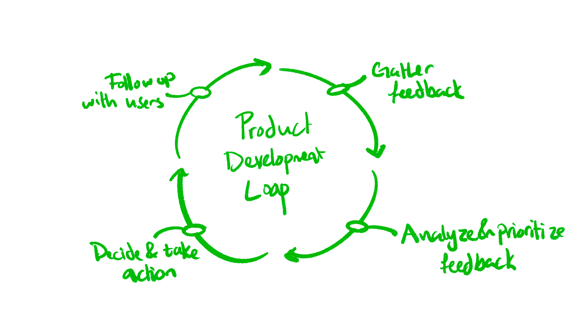
Our first usability tests proved we were on the right track. We'd put a prototype in front of someone, watch where they got stuck, and learn.
This led us to a simple design philosophy:
“As long as what we have now is better than what we had before, it’s good enough to ship.”
This mindset was a crash course in balancing perfectionism with progress. It was better to ship something good, learn from it, and make it better tomorrow.
✢ USER FLOW
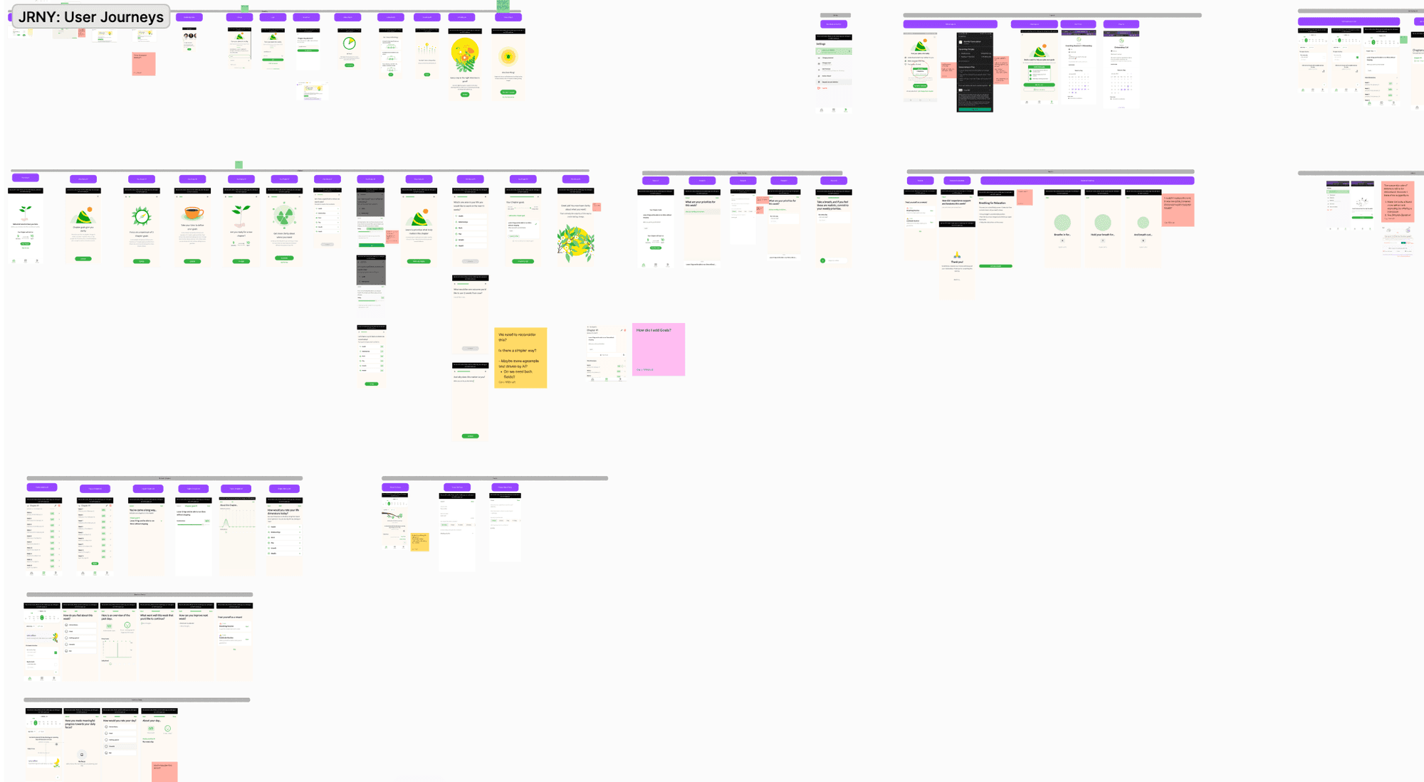
Designing for Clarity
We had to design for everyone, from productivity pros to total beginners. That meant our app had to be simple, but powerful.
Using what we learned from research, I mapped out the user's journey. The focus was on getting goals set up fast, with as few clicks as possible. I wanted it to feel like a “well-lit path”—you should know exactly where to go without thinking about it.
We streamlined everything. We cut redundant steps, merged confusing features, and put the essentials (like daily focus and reflection) front and center. We "stress-tested" every flow with new users to make sure they could get value from the app within minutes.
The flow wasn't just about getting from A to B. It was about making users feel in control, not like the app was bossing them around.
✢ WIREFRAMES
From Sketch to Structure
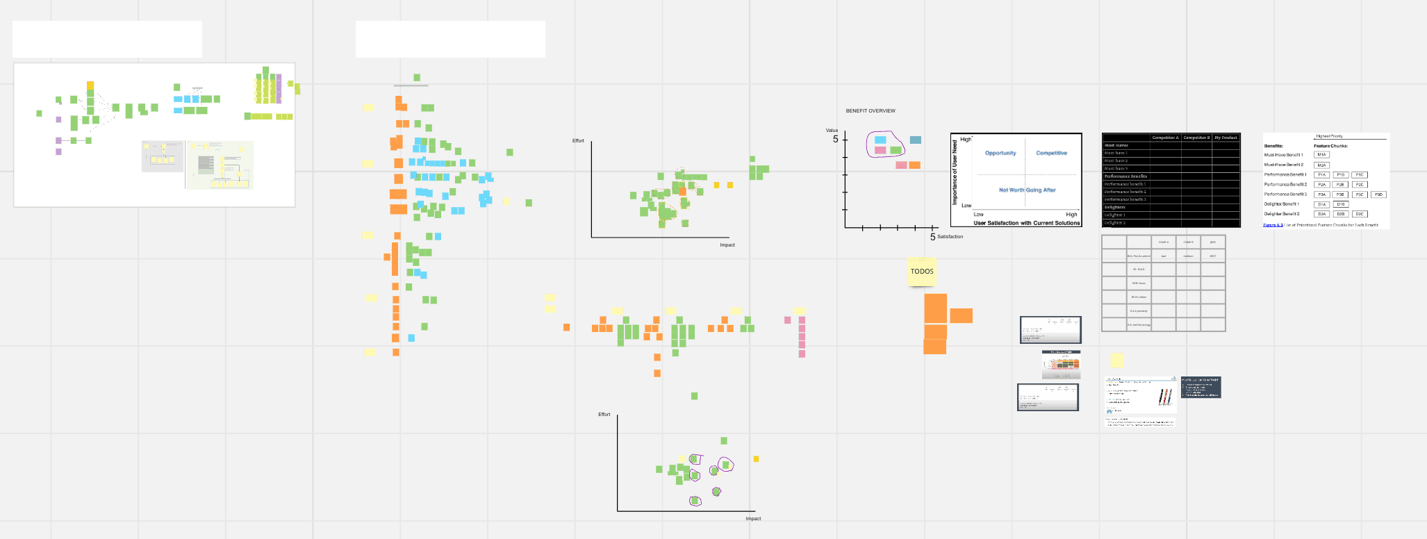
Our wireframing process was fast and messy—in a good way. We started with rough sketches on paper to focus on the core structure, not the visual details.
Testing these simple sketches immediately showed us what was broken. We found confusing navigation, features people ignored, and spots where they just got stuck. These problems became our to-do list for the next version.
With each new round of feedback, I’d build out more detailed wireframes in Figma. By the end of every week, we had fresh insights from the team and from users, which helped us refine the layout before we wasted any time on visual polish.
By the time we got to high-fidelity, interactive prototypes, we were already confident the app made sense. There were no big, costly surprises.
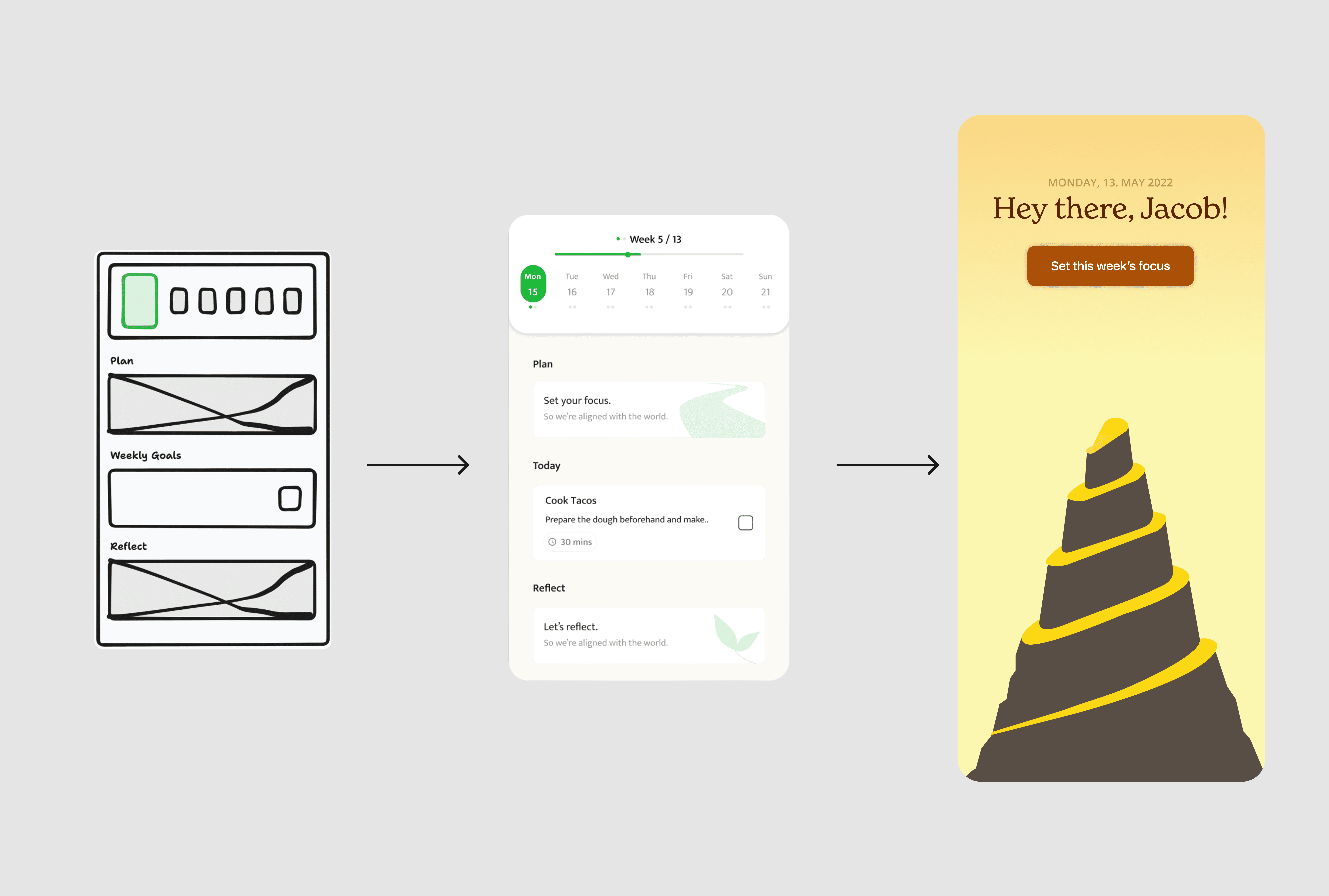
✢ DESIGN
Building a Calm, Modern Look
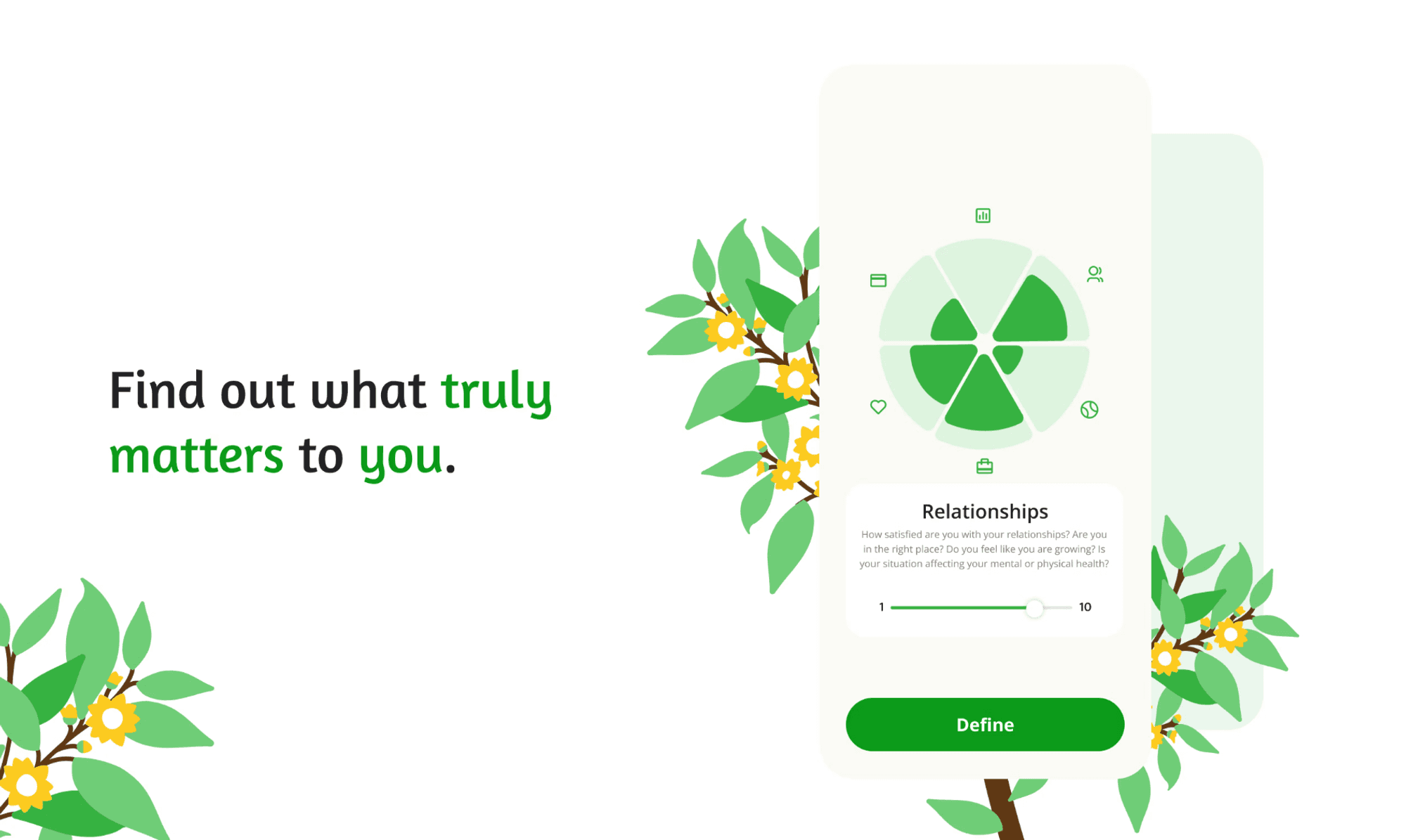
The UI design was where the "mindful" part really came to life. We needed an interface that inspired focus, not pressure.
After trying a few different styles, we settled on a minimal but expressive system:
Color Palette: Calming greens paired with warm, balanced yellows. We wanted it to feel about growth and energy, without being loud or distracting.
Typography: A clean, modern sans-serif that was easy to read on any device.
Layout: A card-based design with tons of white space. This gave the app a light, breathable feel.
I also built a design system in Figma to keep everything consistent. Every button, every modal, and every screen followed the same logic.
We A/B tested our visual choices and ran usability reviews. My personal preferences didn't matter. The only question was: Does this help users stay focused? If the answer was no, we changed it.
✢ FEEDBACK & ITERATION